

Maximise the impact of your brand’s visual identity
What is a visual identity?
Is it really just enticing visuals or is there something mysterious that sits below it all to make it work harder for your business? We’re sharing our insights and why you should be sitting up straight and paying more attention to your identity beyond just the letterheads and business cards. To look at this in context, you really need to look at the bigger picture and ask ‘What is a brand?’ and according to the textbooks:
A brand is also far more than the name, logo, symbol or trademark that highlights its origin; it is imbued with a set of unique values that defines its character and works as an unwritten contract, promising to deliver satisfaction… Brands also seek to connect emotionally with their consumers, to ensure that they are always the first and only choice, creating lifelong relationships.
The visual identity is all things to the eye that brings the above to life. Most would assume it’s a logo and some colours when really it’s a carefully designed system, which uses research, sound rationale and a lot of ideas before you come to that ‘YES!’ moment when you truly capture the essence of a brand in a visual way.
Why do businesses need visual identity?
The visual identity is integral to a business. It connects the voice of a brand with the business strategy, turning it into something compelling we can understand and want to buy into. Without getting the help in that initial buy-in, businesses are creating an uphill battle for themselves.
If you also consider the other half of the point of a visual identity, it creates a first impression – do we like it, does it make us feel at ease, should we trust this business? Research shows a first impression is made in the first 50 milliseconds2. So those precious pixels in your logo better work their hardest for you!
Why is a visual identity important?
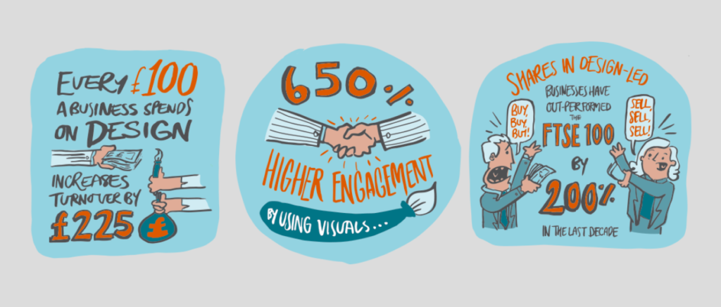
We talk about this all the time, and really it boils down to standing out, but fitting in (in the right way). Here are some stats that sum it all up:
How can a visual identity bring the brand strategy to life?
We recently went to the D&AD Festival in London and Wolff Ollins’ Chief Design Officer, Chris Moody, described a visual identity as “the tools on a mixing desk, they have to be set just right for the brand to work it’s best”. The essential take-away from this is the understanding that we can use the visual identity to amplify the strategy and create something emotionally compelling for all audiences.
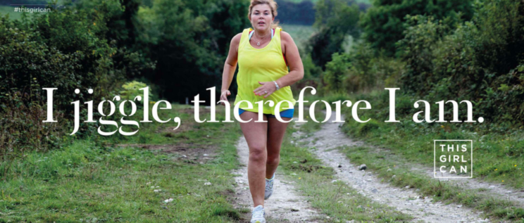
For example, the ‘This Girl Can’ charity initiative from Sport England have a goal of getting as many women as possible active and enjoying exercise, no matter what size, age and fitness level. Their visual identity is empowering, uses bold typography for its statements and motivational photography to reflect its audience in situ. Without this ‘mixing desk’ of visuals, the initiative’s aim would be incredibly hard to achieve.
Can you give some examples of brands that have been successful as a result of their visual identity?
There are so many great examples of brands that have had year-on-year success off the back of their visual identity: John Lewis, Oatly and Yeo Valley (all of which are fantastically full to the brim with pathos). It’s worth noting that they are successes because they not only showcase their brand through their visuals, but they are brilliant at living by their values.
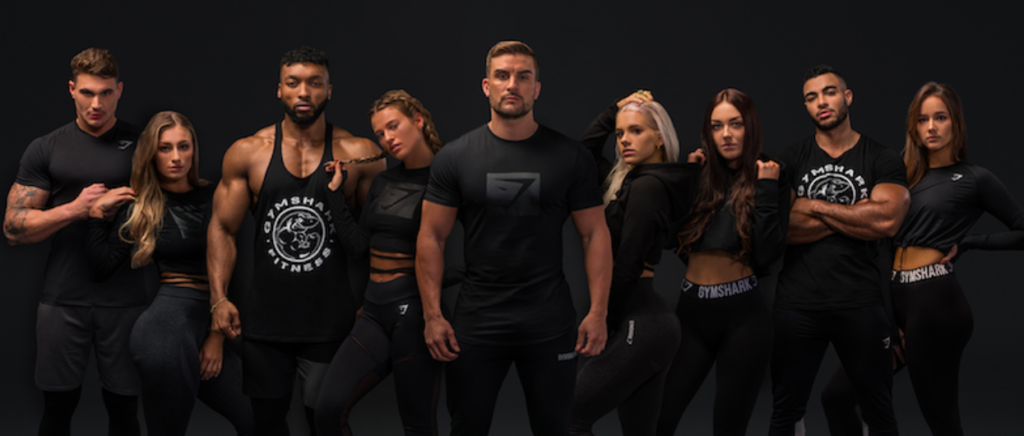
A more local example is Gymshark; their super-intelligent business strategy, complemented by a confident and audience-focussed visual identity, has definitely contributed to their incredible progression globally. These guys are a fantastic example of knowing your audience and how to visually engage with them.
How does research and strategy influence your design process?
A visual identity is extremely fragile without sound strategy. You need this phase and the output to create the strong foundations of any good brand. It dictates who it’s talking to, the personality and the beliefs of the brand. All of these heavily influence the chosen path for visuals.
You wouldn’t have a strong and powerful brand that talks to the engineering industry using watercolours, quaint iconography and romanticised photography. Much like you wouldn’t use macho typography and red and black to brand a chain of whimsical florists. These are very obvious and generalised examples, but it is crucial to know your audience and be clear on what you want achieve in the long run. The only way you can get to this is by discovering those magical nuggets of insight found through intensive research and valuable creative strategy.
Can you give an example of a client’s visual identity that has had a real impact?
Since we launched the rebrand of EU Automation, the figures soared from £10m to £30m turnover in 18 months and have grown so much as a company, employing more people, and expanding globally. We don’t think this is purely from an external perspective of customer just liking the look and feel of the new brand, but also around the employees having a new and exciting company they can be proud of. As the business is predominantly sales-based, it gave the team a new lease of life where they wanted to show off their new brand to their customers and talk about to anyone and everyone, much like an aunt or uncle showing of their newest niece or nephew. This drive created better engagement, better relationships with the customers and off the back of it, a roaring success for the business.
What are your top tips to making sure you have a strong visual identity?
Make sure your identity represents you and your vision. You will never truly get the most out of it unless you believe in it.
Keep your logo fuss-free and legible. It should work on a postage stamp as well as on a billboard. There’s a reason the Nike tick is iconic.
Plan for the future. And by this, we don’t mean slapping your logo on a self-driving Google Car. We mean understanding your 1, 3, 5,10 year plan, so you can gauge how hard your identity needs to work to get your there.
Be aware of your competitors. Whilst we know you need to stand out, you also don’t want to be a sore thumb. Understanding who you’re up against will enable you to leverage your strategy and get you to that visual sweet spot, differentiating in your industry.
Bespoke photography = King. Stock photography is used time and time again in the agency world and whilst it’s an affordable option in the short-term, photography is often an integral part of a brand long-term. There have already been instances where stock imagery has been used twice in the same newspaper spread, or even by competitors. Invest in bespoke photography, even if it’s only 15 – 20 images, and your brand will truly stand out.